Excel 2013 Quick Analysis Feature
Microsoft introduced a new feature in Excel 2013 to organize and analyze data easily named as Quick Analysis. This feature includes five options such as formatting, total, Sparklines, tables, and charts. With the help of these options, you can apply formatting to data and convert that data into the form of charts or PivotTables etc. As the name itself indicates, it performs all these tasks quickly and with a minimal number of steps. All Quick Analysis features are dynamic, it means when you select the range of data, all these options will appear on the type of data, you’ve selected. Here is small look of Quick Analysis Feature:

How to use Quick Analysis Feature:
First select the data as much you want & you will see Quick Analysis option at lower-right corner of your data set or You can also use shortcut the Ctrl + Q to open Quick Analysis Feature:

When you click on this option then you will see the following options for converting your data as below:

Let’s have a look of all following five options:
FORMATTING: You can use this option to highlight any part of your data by adding various options like data bars and color scales, icon set, greater than etc. If your data covers any high & low value then you can highlight it with the different color scales. To using this option, first select the data whether that be a column, a row or a table. After that you will see a Quick Analysis button appears at the bottom right of your selected data. After that you will see following options:Let’s take a example of live preview of all features of Formatting such as Data Bars, Color Scale Icon Set, Greater than, top 10% etc.
Color Scale

Data Bars

Icon Set
Greater than

Top 10%

You can also remove any formatting by click 'Clear Formatting' in the Quick Analysis gallery.
Here is the small clip of Formatting feature:
 CHARTS: You can use this option to display your data in the form of different charts like line, pie,More Charts.
clustered bar depends upon your type of data. If you want more options in chart, click on
If you have already decided the chart type to illustrate your data, then you can select it directly by using 'Recommended Charts tool'. You can use this option by selecting it from the Insert tab on the Ribbon. Now you’ll see different charting options such as pie, line, and bar charts.
Let’s take a look of Clustered Column chart:

Line Chart

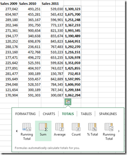
 TOTALS: You can use this option to calculate the numbers in columns and rows. This part has many
options like sum, average, count etc as clearly shown in the pictures. You can choose more options with right/left scrolling arrows. You can see result of the totals by selecting the range of your data that will appear below of the selected range or to the right of the selected range.
Lets have a look of SUM option:
% Total


display its Table and Pivot Table buttons.
Filter your data:
- If you want to filter your data then click on Table Now Click the arrow in the table header of a column
- To filter data, first uncheck the 'Select All' box and then check the boxes of the data that you want to show in your table

- Then click 'OK'.
Sort your data:
- To Sort your data, Click on option 'Sort A to Z' or 'Sort Z to A'.

- Then click on OK.
When you rolling mouse over the PivotTable thumbnails, you will get different summary of your data. After Clicking on the PivotTable thumbnail, you can create the PivotTable on a separate sheet.
You can also create PivotTable manually:
- For this first select the range of data and then click the PivotTable command button on the Ribbon’s Insert tab.
- After that you will see the 'Create PivotTable' dialog box and then select all the data in the list that contains the cell cursor.
- After that by default Excel builds the new pivot table on a new worksheet. If you want add the pivot tables on the same worksheet then click the Existing Worksheet button and then indicate the location of the first cell of the new table in the Location text box.
The PivotTable Field List task pane covers two areas which clearly indicate in following picture:

 SPARKLINES: You can use this option to show tiny graphs alongside with your data. This option
 covers three types of sparklines: Line, Column, and Win/Loss.
Let’s have a look of Sparklines:

You can also add sparklines using the Sparklines command buttons on the Insert tab of the Ribbon by using following steps:
- First Select range of data in worksheet that you want to represent with sparklines.
- After that Click on chart type that you want to show alongside with your data such as Line, Column, or Win/Loss. In the Sparklines group of the Insert tab or press Alt+NSL for Line, Alt+NSO for Column or Alt+ NSW for Win/Loss.
- After that you will see Create Sparklines dialog box containing two text boxes:
- Data Range: Shows the cells you select with the data you want to graph.
- Location Range: Lets you designate the cell or cell range where you want the sparklines to appear.
- After that select the range of data where you want your sparklines to appear in the Location Range text box and then click OK.
NOTE: All these options may change as many times as you choose it. These changes based on the type of data you have selected in your workbook.

Comments
Post a Comment